Intro
Growth Factory Ventures
Brand identity and website for a hands-on venture firm.
I approached Growth Factory Ventures’ identity through the relationship behind the investment. GFV brings capital, operating experience, and company building together. I wanted founders to get a sense of that involvement from their first encounter with the brand.
My role was to develop the identity and website, then carry those decisions into marketing materials, guidelines, and merch. The challenge was to give GFV a bold, confident presence while keeping the people and practical work behind it in view.
- Scope
- Brand identity Website design Marketing materials Scalable brand system Merch
Strategy
Capital and company building, brought closer together
Growth Factory’s roots are in Sacramento’s entrepreneurial community, known as the Backyard. Before GFV became a fund and venture studio, that community was already bringing founders, operators, and investors together. That history mattered to how I approached the brand: there was a real sense of involvement to build on.
I wanted the identity to carry that character into a more ambitious expression. “Engineering Wins” gave me a useful starting point. To me, it connects the belief needed to back an early idea with the deliberate work of building a company. The design needed room for both: a clear, ordered structure and enough energy to feel optimistic about what founders could create.

Logomark
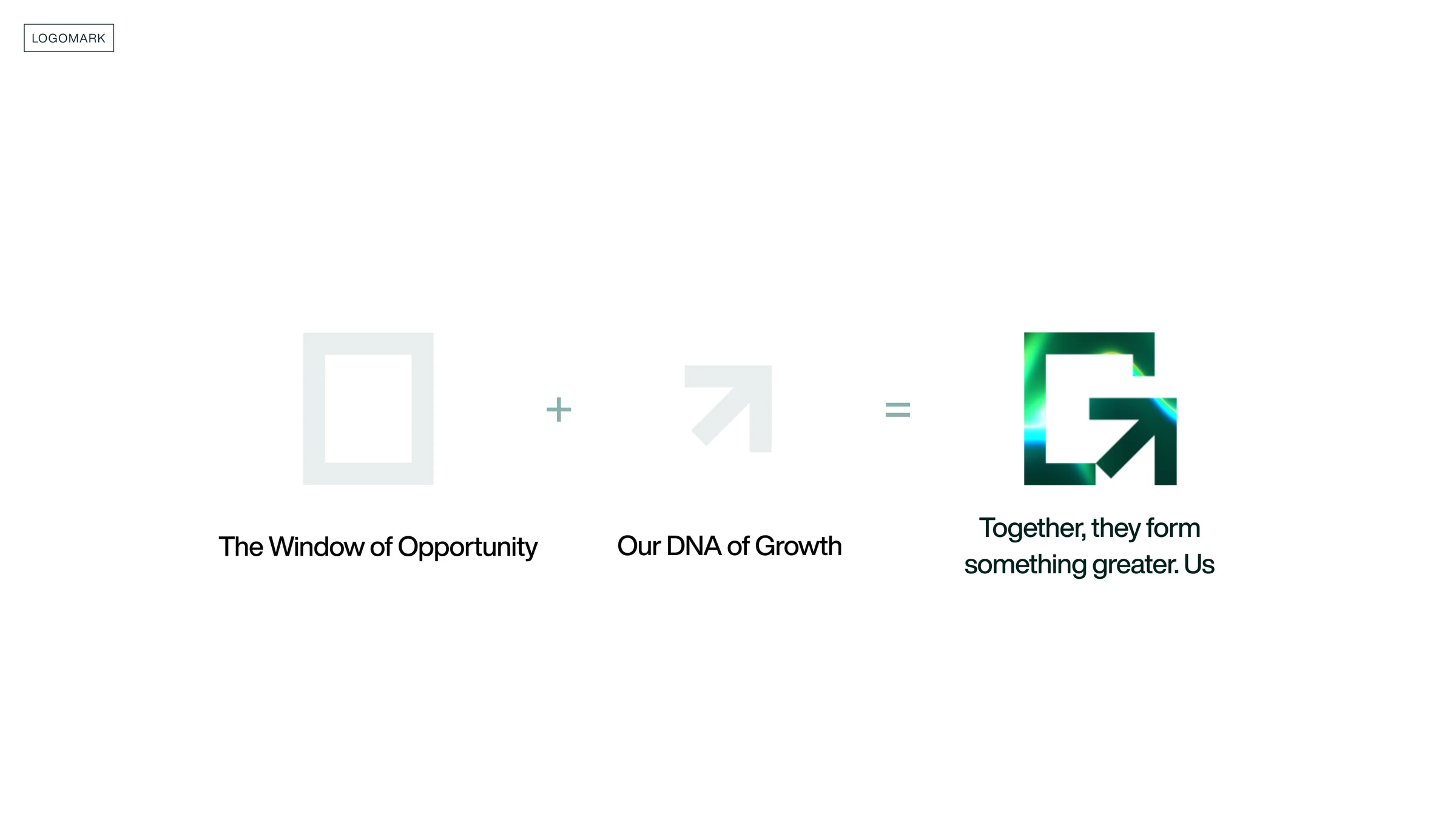
An opening for opportunity, a direction for growth
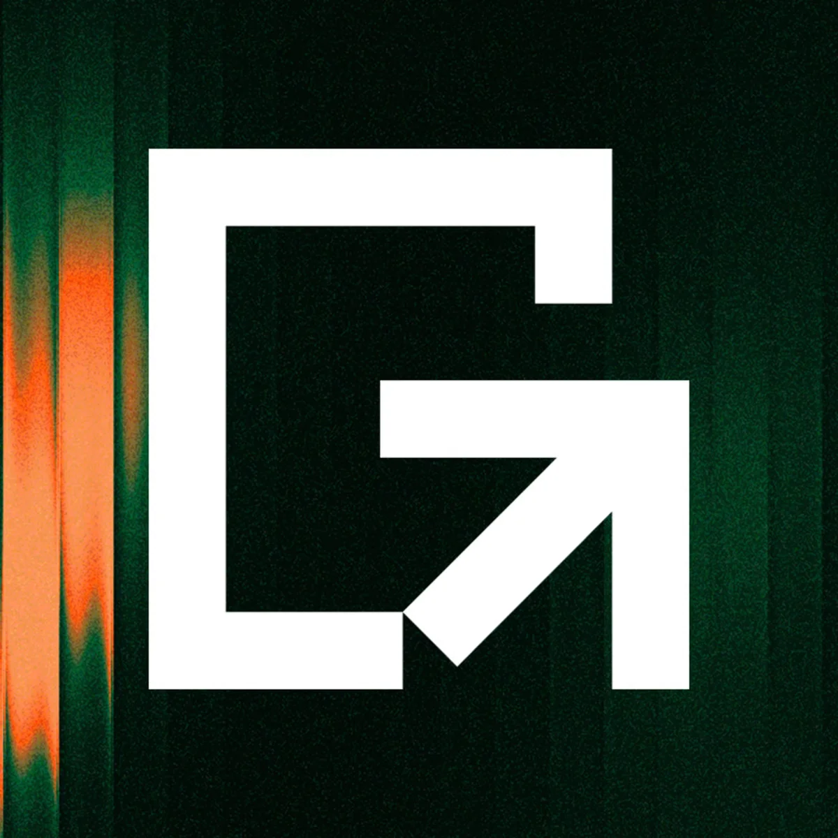
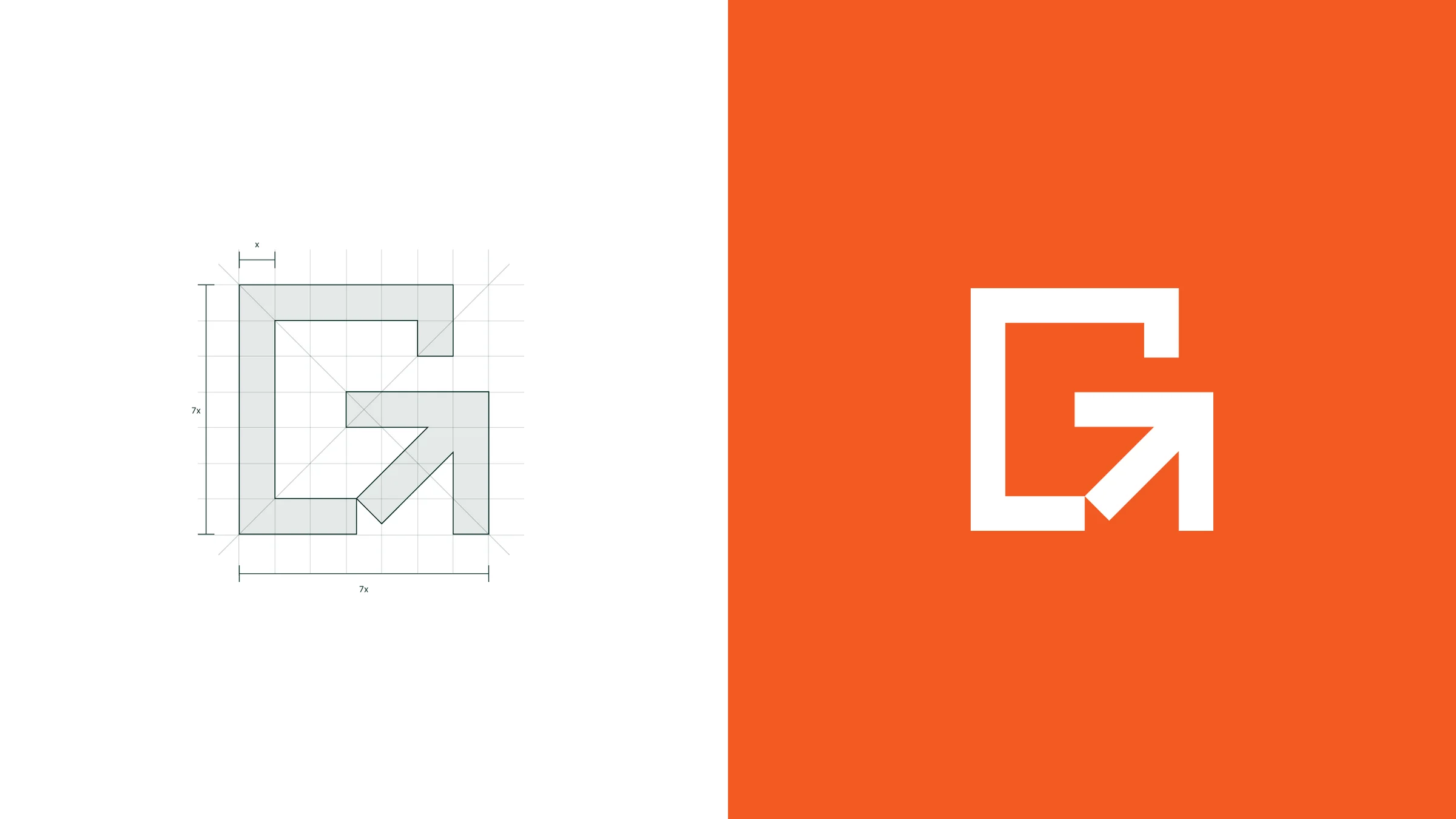
I brought the idea of opportunity into the mark through an open window. An arrow grows out of that frame, giving the opening a direction. Together, the two forms connect the moment of seeing potential with the decision to move on it.
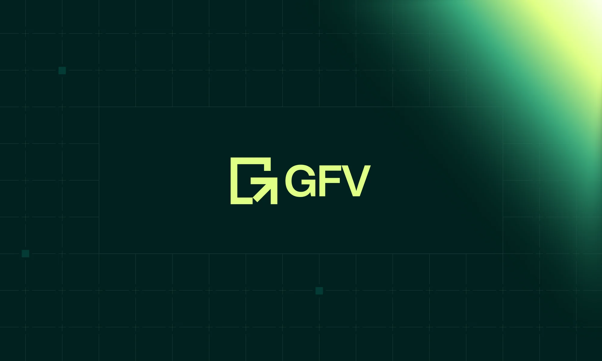
The square construction became an anchor for the rest of the identity. I could use it at a small size in a website header or let it take over a cover. Its geometry also gave me a starting point for the rectangular frames and repeated bands that appear throughout the work.
Typography
Antonio and Helvetica Now Display
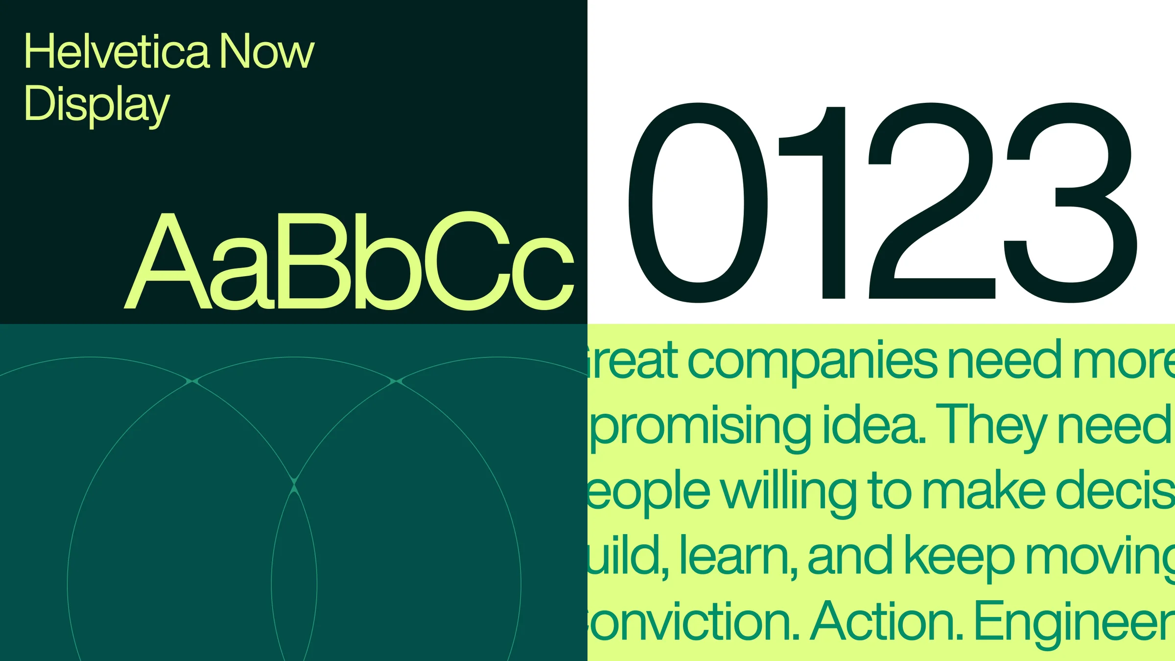
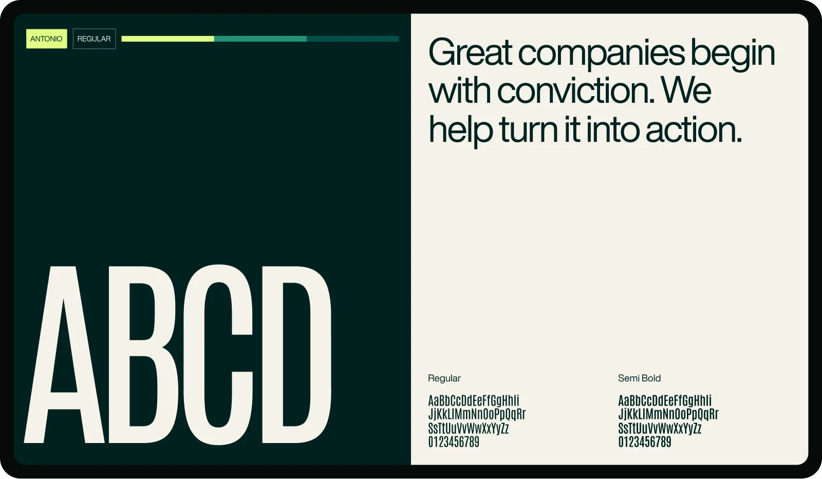
Growth Factory Ventures is a long name, and I wanted it to have presence when set large. Antonio’s narrow proportions let the full name hold together in a strong, compact line. The same quality works for short statements such as “Engineering Wins,” where a few words need to carry the composition.
The website also has a lot to explain. I paired Antonio with Helvetica Now Display for introductions, offering descriptions, navigation, and supporting text. Its wider proportions give those passages more breathing room. I used the contrast between the two to guide the pace: a direct statement first, followed by an explanation someone can comfortably read.
Color
Primary and supporting palette
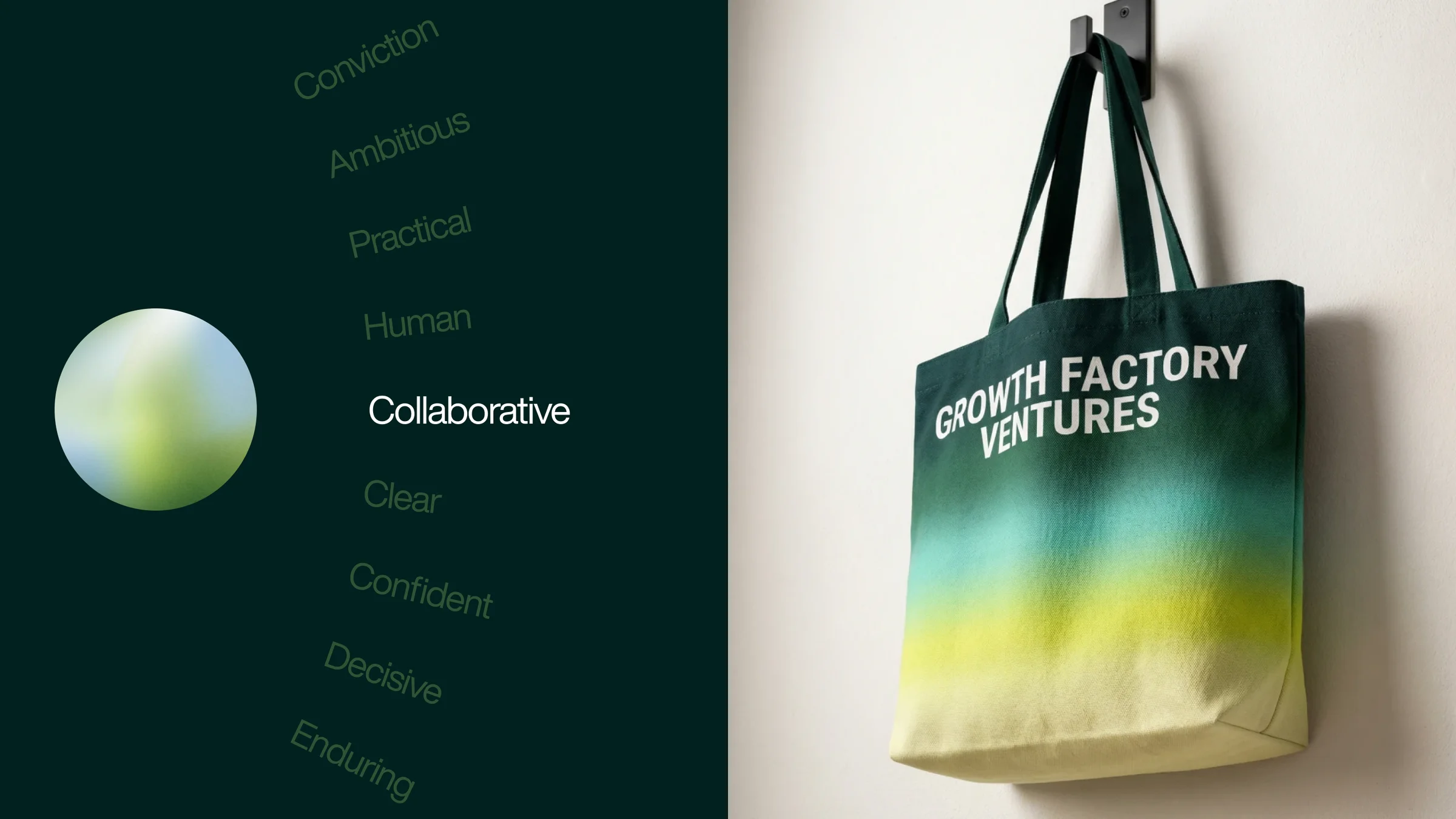
I started with Obsidian Green as the color the brand could keep returning to. It gives the large compositions weight and makes a strong setting for photography and type. Catalyst Lime brings a much brighter energy, while lavender gives me another way to open up a layout without relying on lime everywhere.
Orange became a shared accent across the wider palette. The supporting greens, warm shades, and purples give Capital, Studio, and the Partner Network room to vary their expression. In the motion study below, I wanted those relationships to be visible: the primary colors establish the composition, then the three shade families rise into it together.
The idea
Giving “Engineering Wins” a visual voice
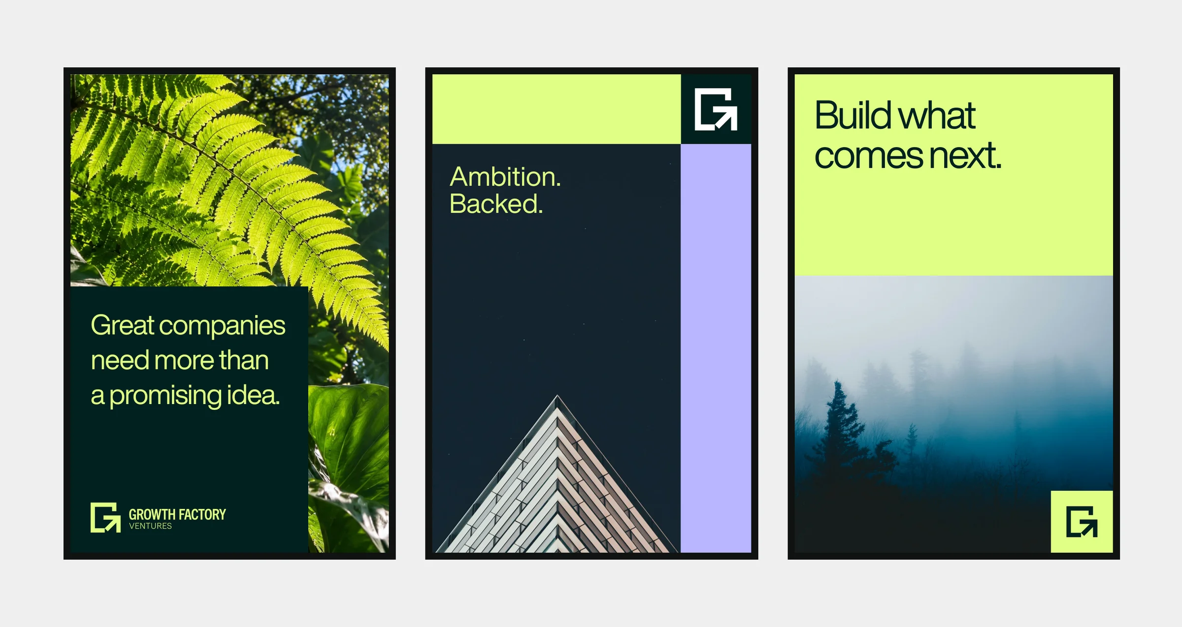
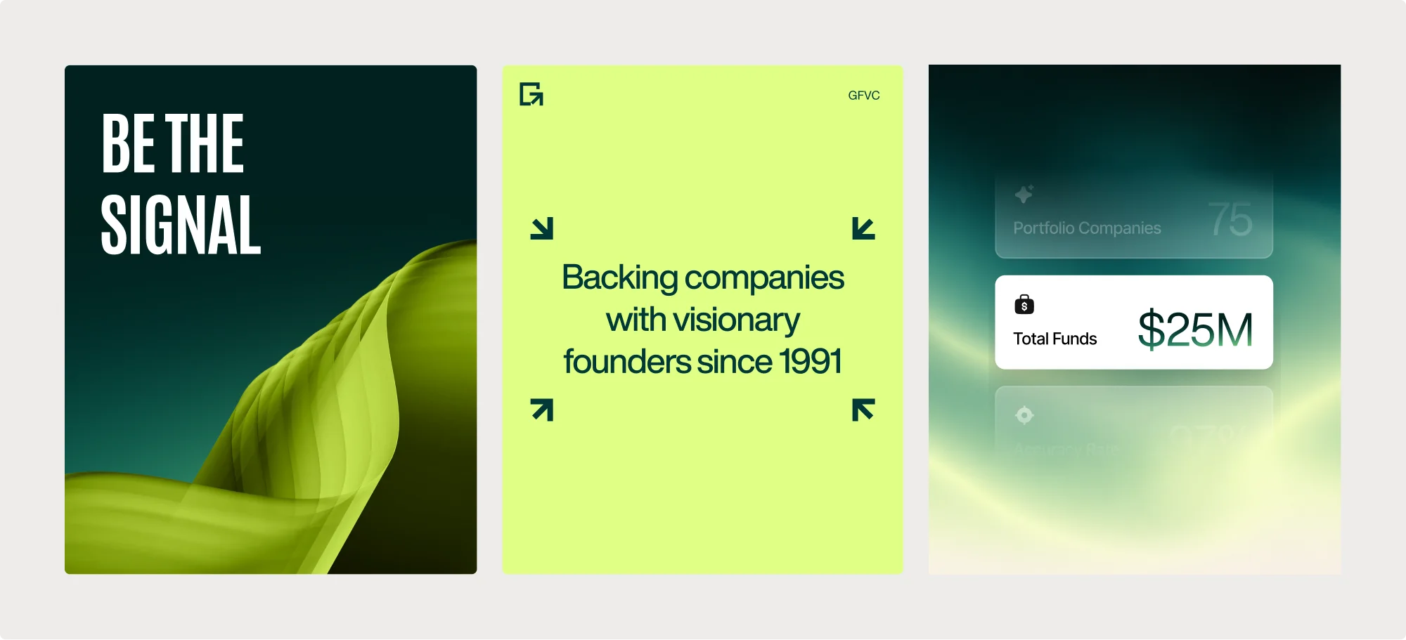
Once the foundations were in place, I wanted to see how far the identity could stretch. The square modules and progressive bands gave me a consistent structure, but repeating one arrangement would have made the brand feel static. I explored changes in scale, density, cropping, and color to keep that structure useful across different formats.
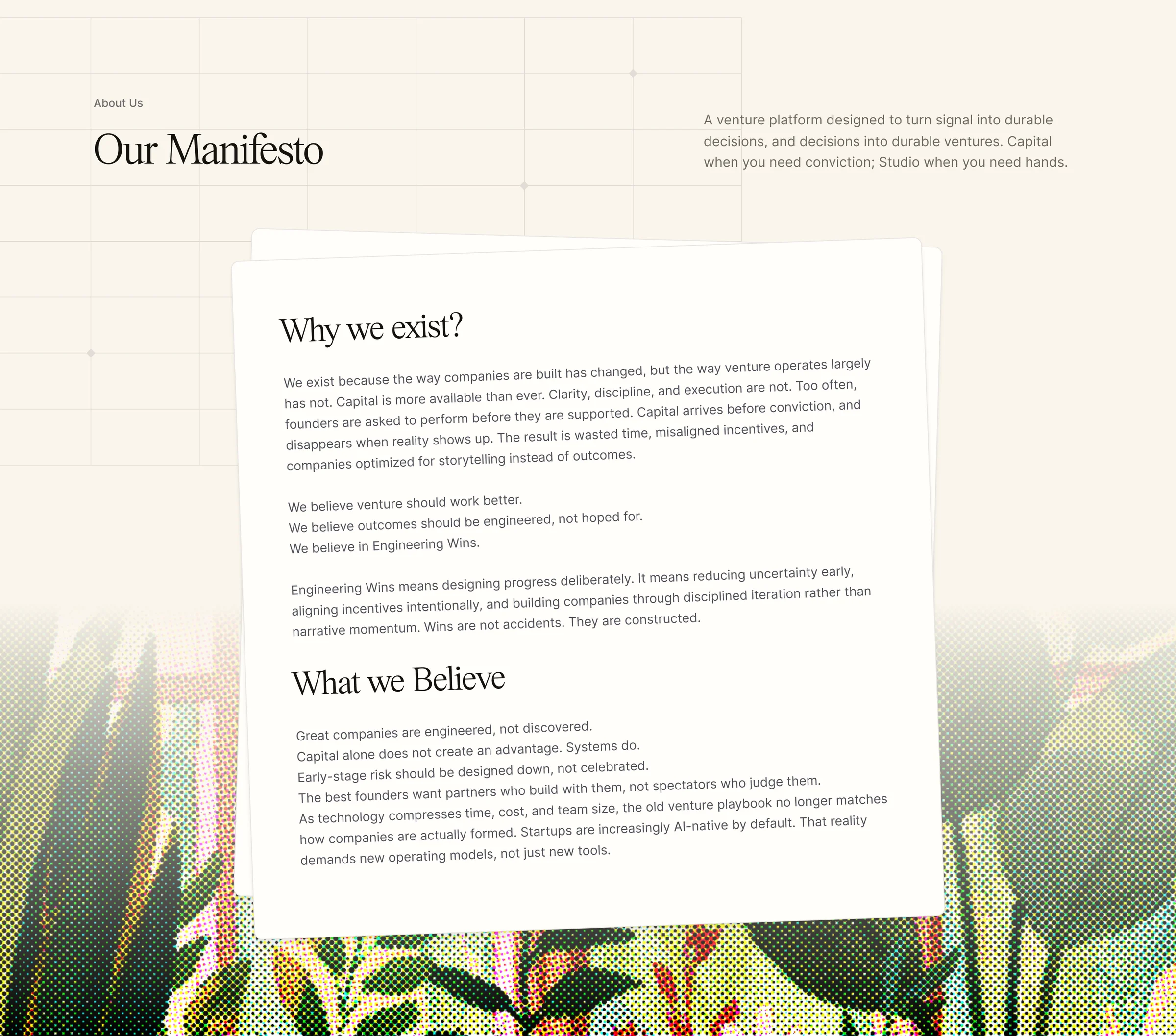
Photography brings another side of GFV into the work. People make the relationship with founders tangible; landscapes and natural textures give the compositions space and a sense of possibility. I looked for bright color, candid expressions, and movement so the imagery could carry some of the optimism behind the brand. The aim was for each piece to feel individual and still belong to Growth Factory.

The website
Helping founders understand what Growth Factory Ventures offers
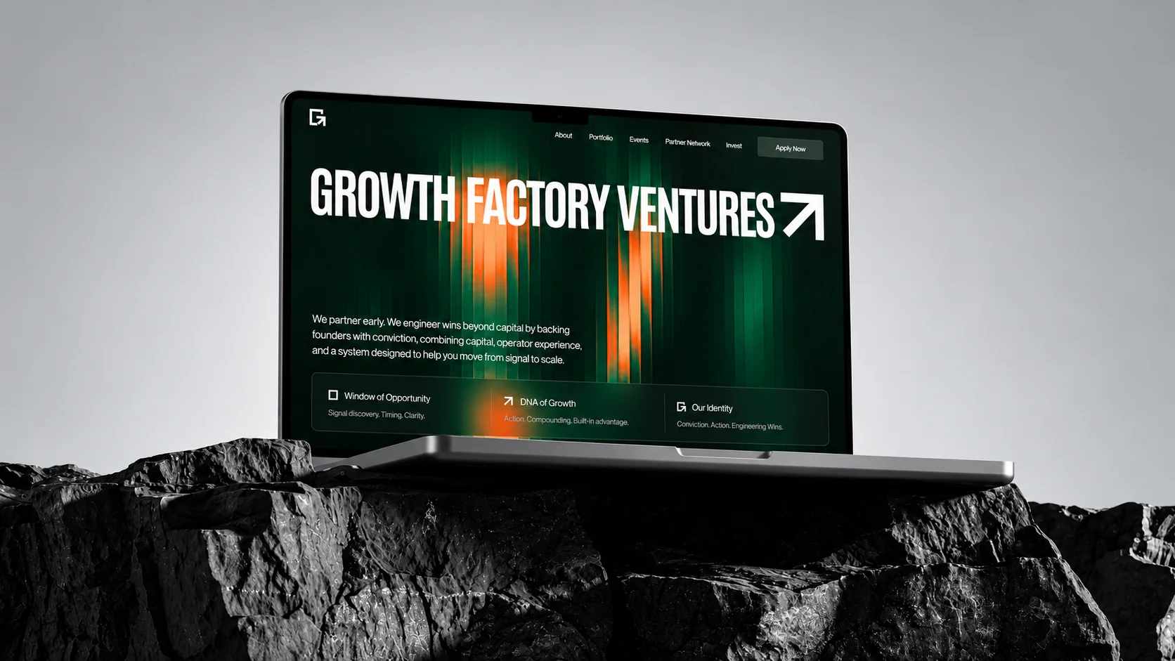
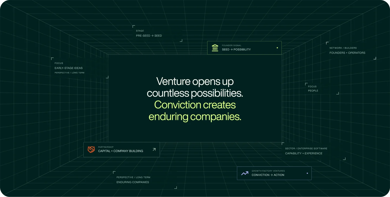
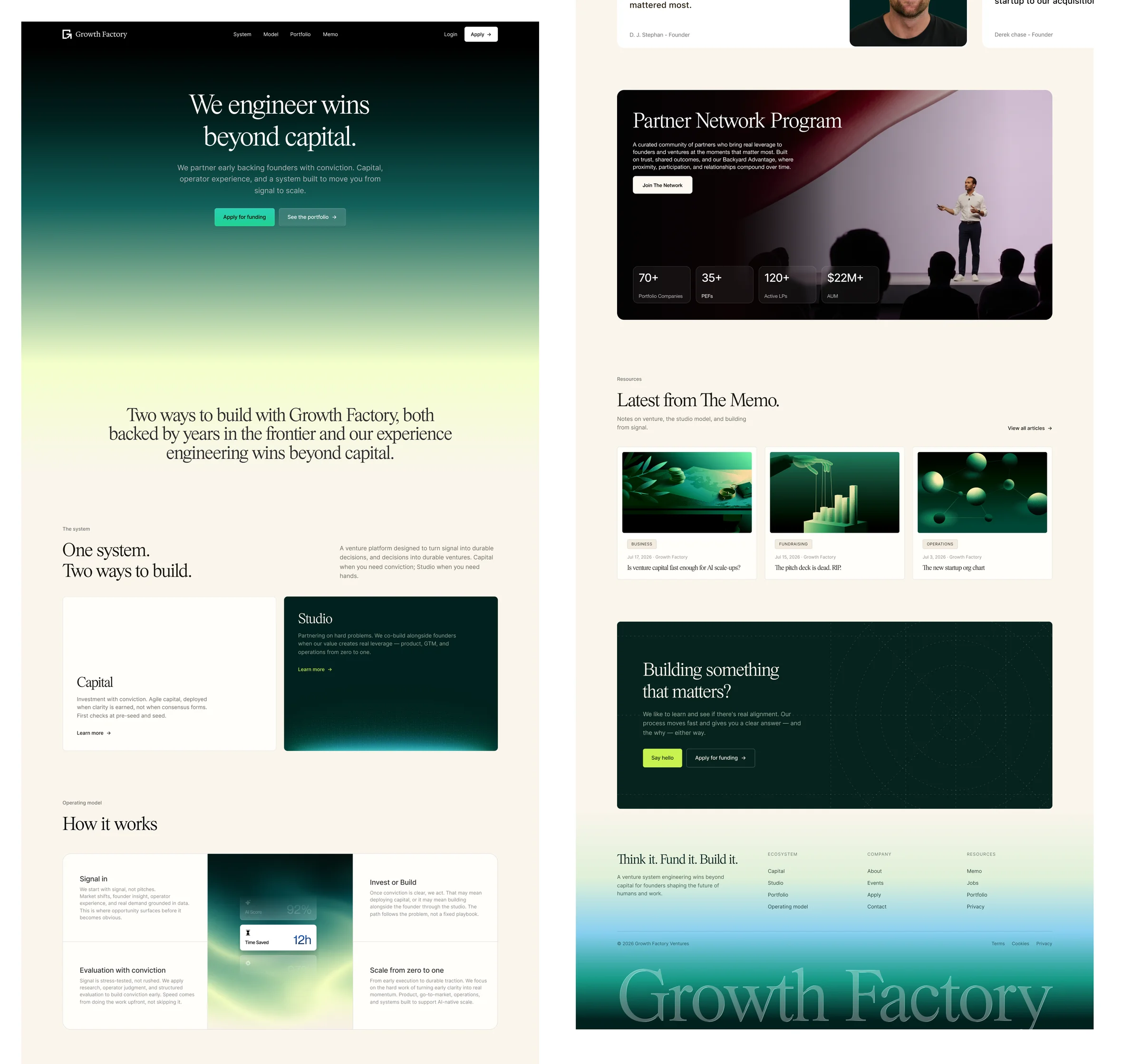
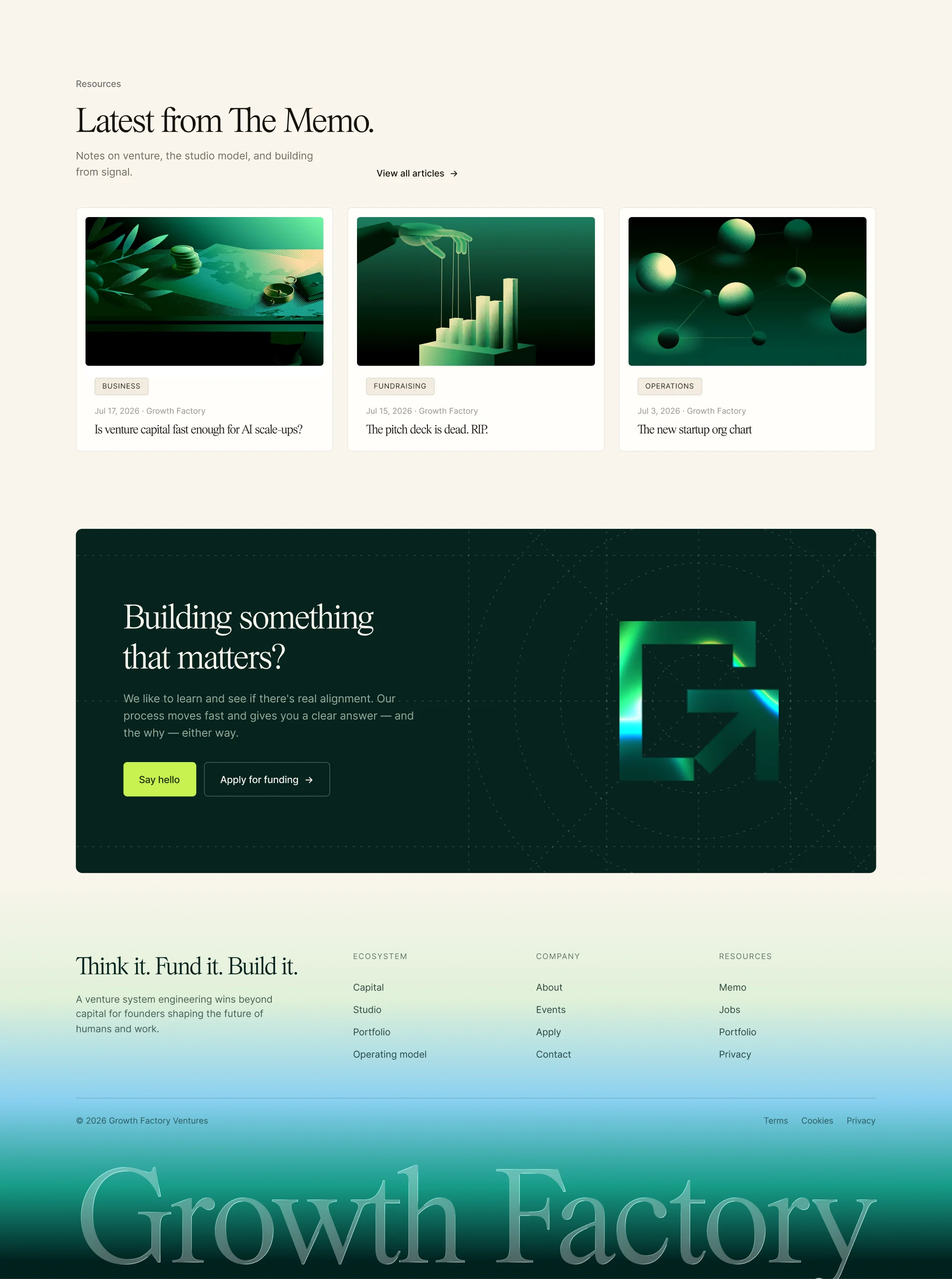
For the website, I kept thinking about a founder arriving with an idea and trying to work out where GFV fits. They need to understand what the team offers, how it makes decisions, and what working together could involve. The identity has to draw them in, and the content has to answer those questions.
I organized the experience around the firm’s approach, its Capital and Studio offerings, and the people behind them. The bold opening establishes the character of the brand, then the page makes space for more detailed reading. That balance lets the site introduce GFV with confidence while giving founders a clearer basis for starting a conversation.
Brand architecture
Different roles, one shared identity
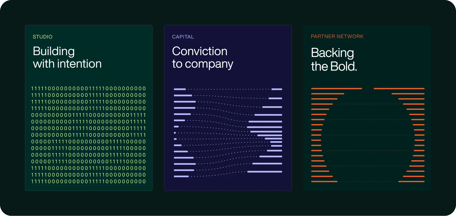
Capital, Studio, and the Partner Network each play a different part in the founder’s journey. I wanted those roles to be easy to recognize within the same Growth Factory identity.
The mark, type pairing, and modular layouts stay connected across all three. Color does more of the differentiating: deep greens for Capital, brighter lime for Studio, and purples for the Partner Network. This gives each part its own emphasis while keeping the relationship between them visible.
Beyond the website
Making the identity work in everyday use
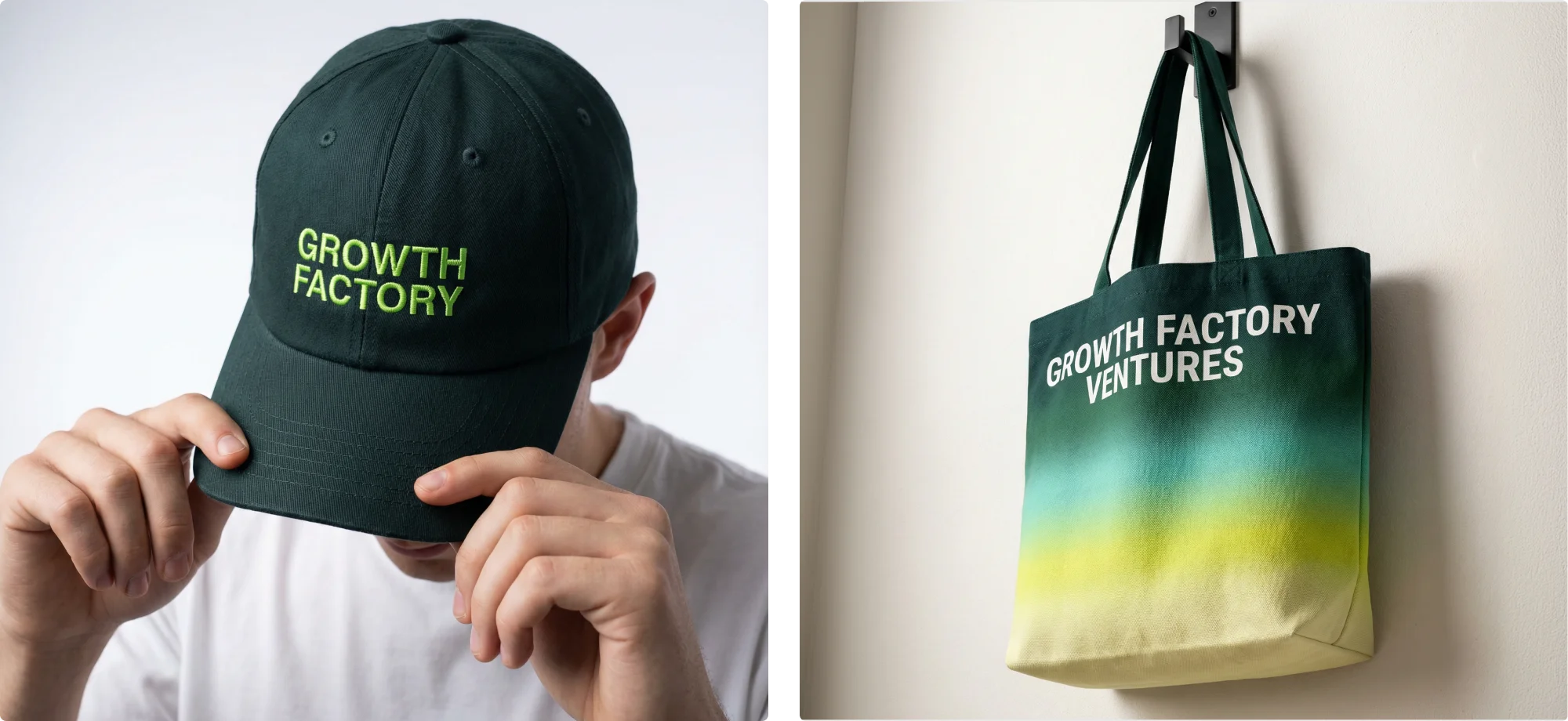
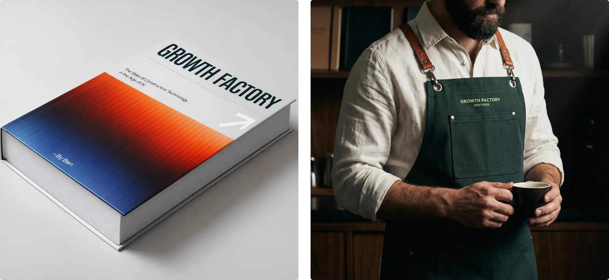
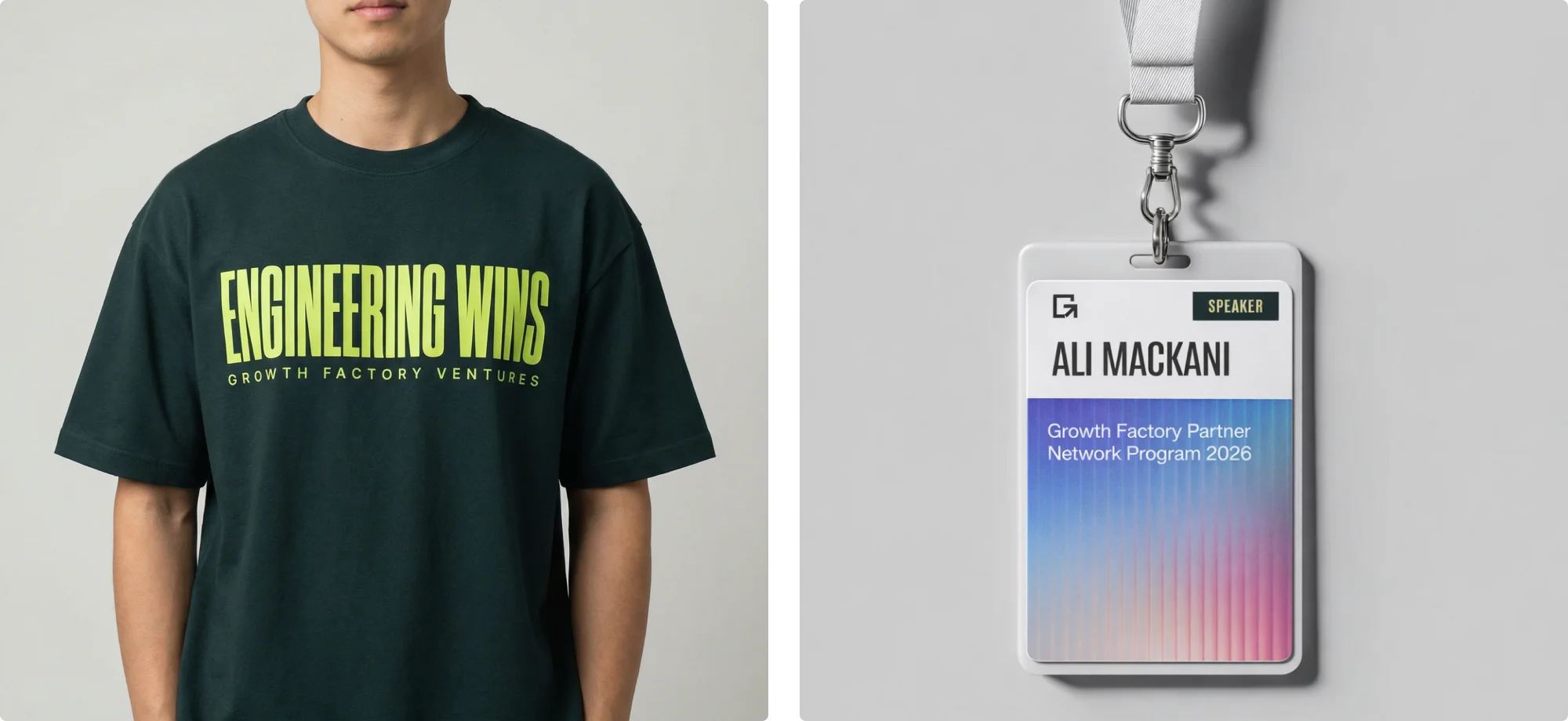
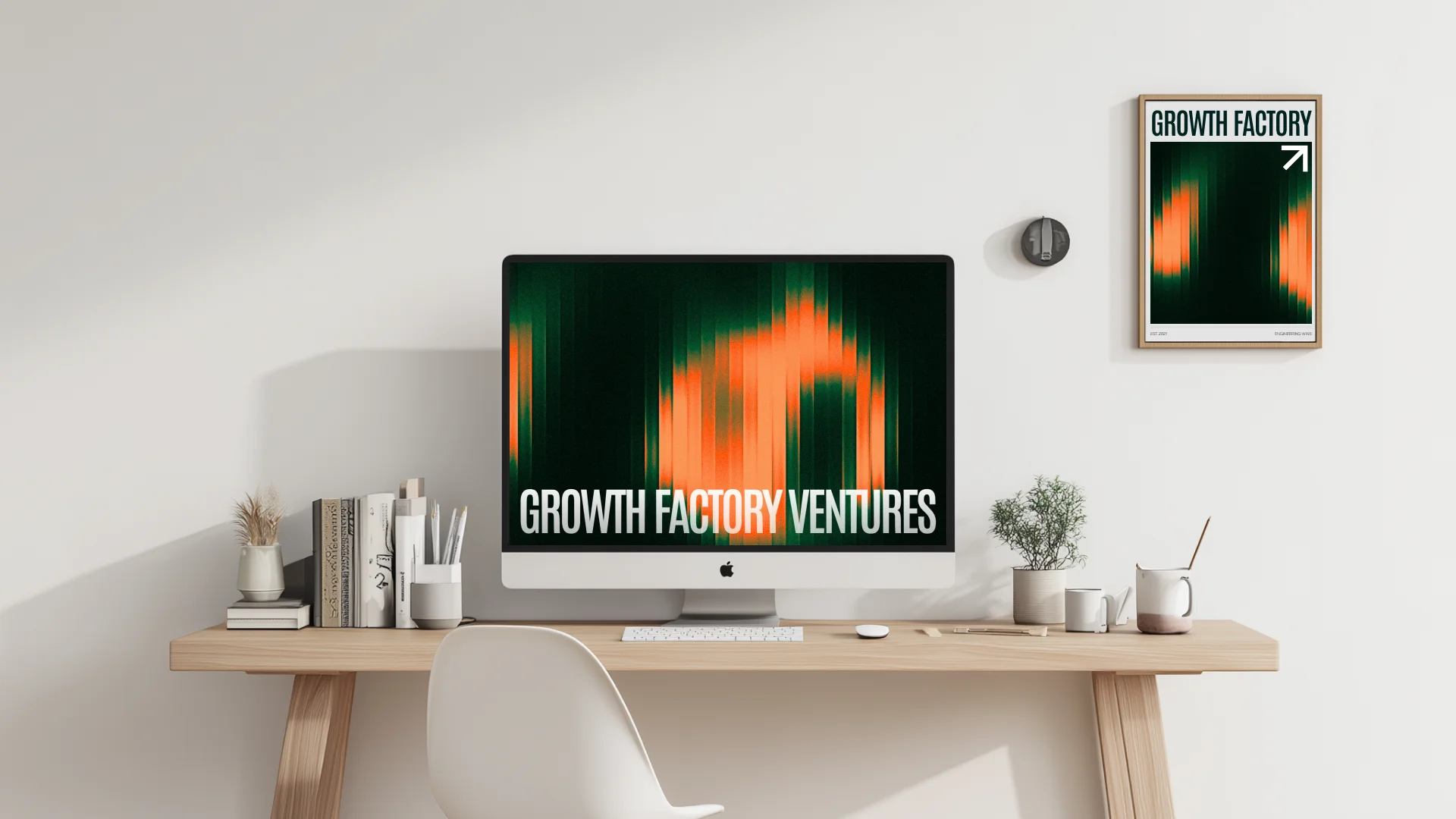
I used the applications to put the identity through different situations. A report needs room for information. A shirt or tote needs a much simpler gesture. Event materials have to register from a distance. Each format asks something different of the same elements.
These explorations helped me judge where to make the name prominent, where the mark could stand on its own, and where color or photography could lead. The result is a range of expressions GFV can draw from as it shows up in founders’ everyday lives.
Bringing it together
A shared foundation for what comes next
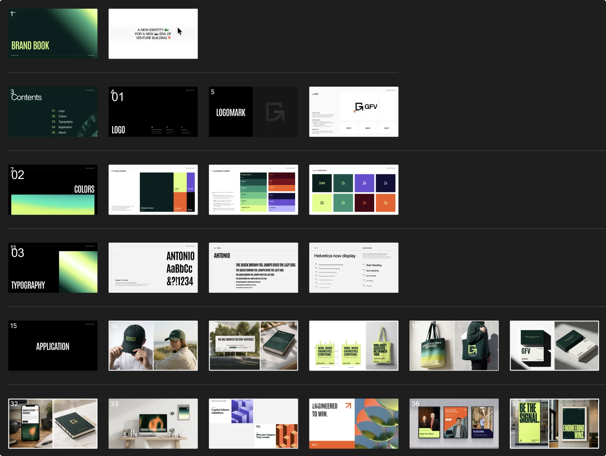
I gathered the decisions into a brand book so the thinking could travel with the assets. It documents how the mark, typography, color, photography, and layouts work together, with examples to make those choices easier to apply.
For me, the thread through the project is involvement. From the opening in the mark to the people in the imagery, I wanted Growth Factory Ventures to feel like a team ready to take the next step with a founder.