Intro

VentureOS
Designing a clearer path for founders from pitch to investor review
VentureOS is an AI-assisted platform that helps founders apply for funding and connect with relevant funds.
I designed the founder application journey from the ground up, working with product and engineering as the platform’s research capabilities evolved.
- Role
- Product design, UX strategy, interaction design and design system
- Timeline
- Four months
- Collaboration
- Product and engineering
Problem
Applying for funding meant repackaging the same work and repeating information founders had already shared.
Founders were pitching the same deck ten times over, chasing warm introductions and reformatting materials for every fund. Fundraising stretched across months of decks, forms, emails, portals and data rooms.
Yet all that preparation could lead to a brief first impression: Research reported an average of 2 minutes 42 seconds spent viewing a pitch deck. Founders had to make their business understandable quickly, but each application asked them to repackage existing work into a fixed set of questions, with limited room to explain what made their company different.
Solution
Start with the founder’s existing work, then ask for the missing context
I organized the application around materials founders already had. Research established what was known about the company; focused questions gathered the missing context before submission for investor review.
Research
Existing application formats made founders repeat work they had already done
I began by analysing how founders applied through decks, forms, emails and portals, looking for repeated work and gaps in those formats. Fixed forms could standardize input, but their questions did not adapt to what a founder had already shared or what still needed explaining. This pointed toward a more interactive application that could respond to the information available.
In product discussions, we separated the information needed to understand a company from the format used to provide it. Deck text and imagery, supporting documents and product demos could all carry useful context.
Approach
Let the research inform what we ask next
The product team’s AI direction made this approach possible: combine submitted materials with relevant external research, build company context and identify gaps. The original research framework covered eight areas, including product, team, market, traction, funding and go-to-market.
My challenge was to design how founders participated in an AI-assisted evaluation: understanding what the system had learned, seeing why further questions mattered, and contributing the context investors needed to assess their business.
The central design tension was how much of the system’s work to expose. Too little information left a founder waiting without context. Too much could turn the application into a research dashboard they had to learn before continuing.
Key decisions
Make applying effortless
I focused on three ways to reduce the work founders needed to do before investor review:
- Reuse founder background. A LinkedIn URL could supply background and experience without another profile form. Inferred company details still needed a way to be checked or changed.
- Accept existing materials. I made support for decks, documents, URLs, video links and written responses explicit at intake, so founders knew they could reuse their existing work.
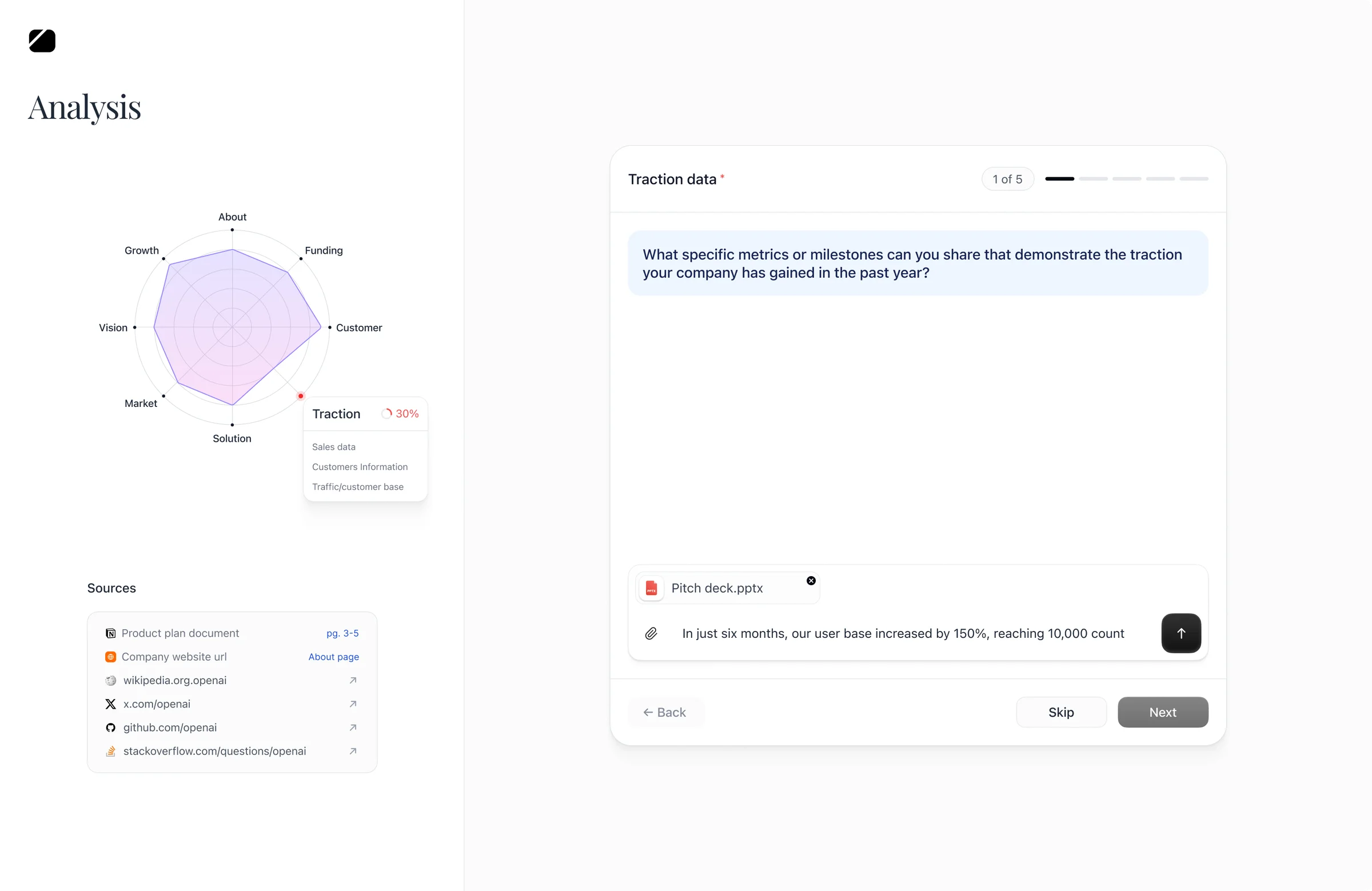
- Do the research before asking for more. The platform gathered and cross-checked company information, then asked focused questions where context was still missing. I also explored broader milestone questions that could inform several areas at once.
Key decisions
Show founders how their company was being understood
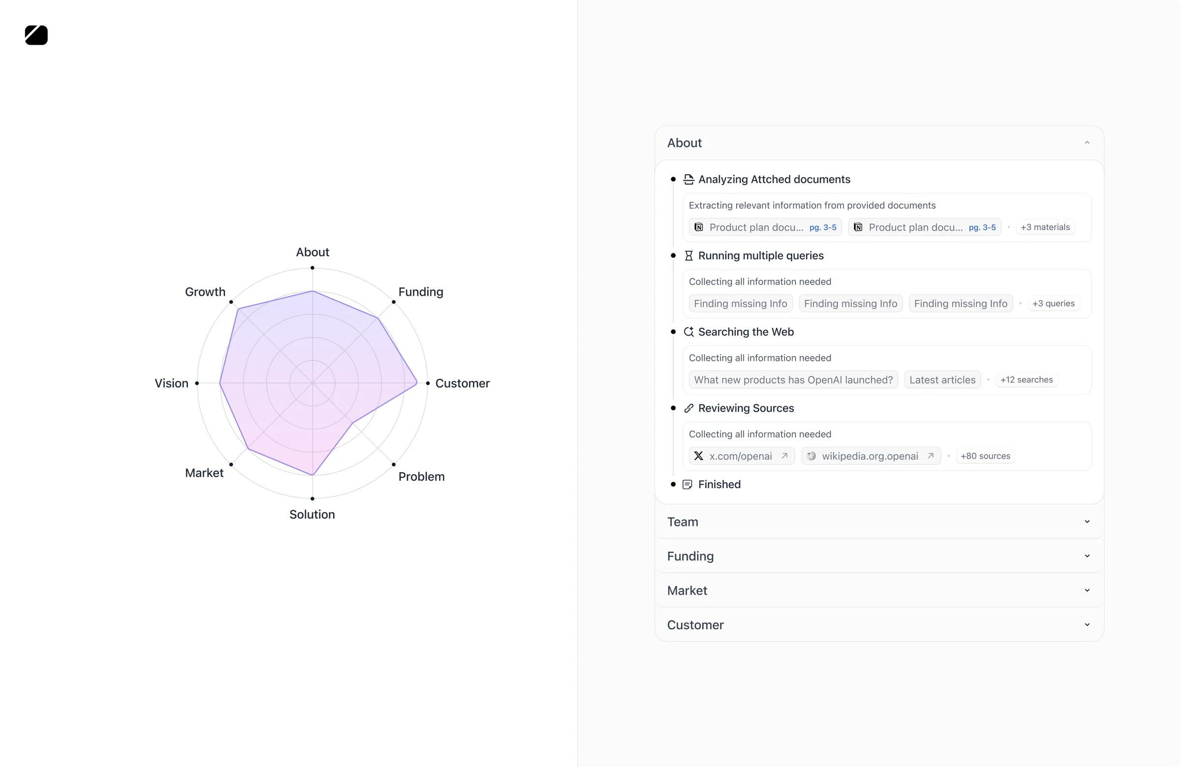
Founders needed to see how the platform understood their company and what work informed that view. In my testing, a skeleton sometimes looked stuck, while other updates disappeared too quickly to read.
I organized research into stages and topics with findings and sources that founders could revisit. Beside each question, a persistent analysis panel highlighted the information the answer could improve, keeping the question connected to its purpose.
Each topic had its own thread for answers, supporting material and clarification. Research coverage needed to be distinguished from investment quality: a low score could mean the system needed more information, without implying that the company was weak.

Key decisions
Give founders something useful beyond the application
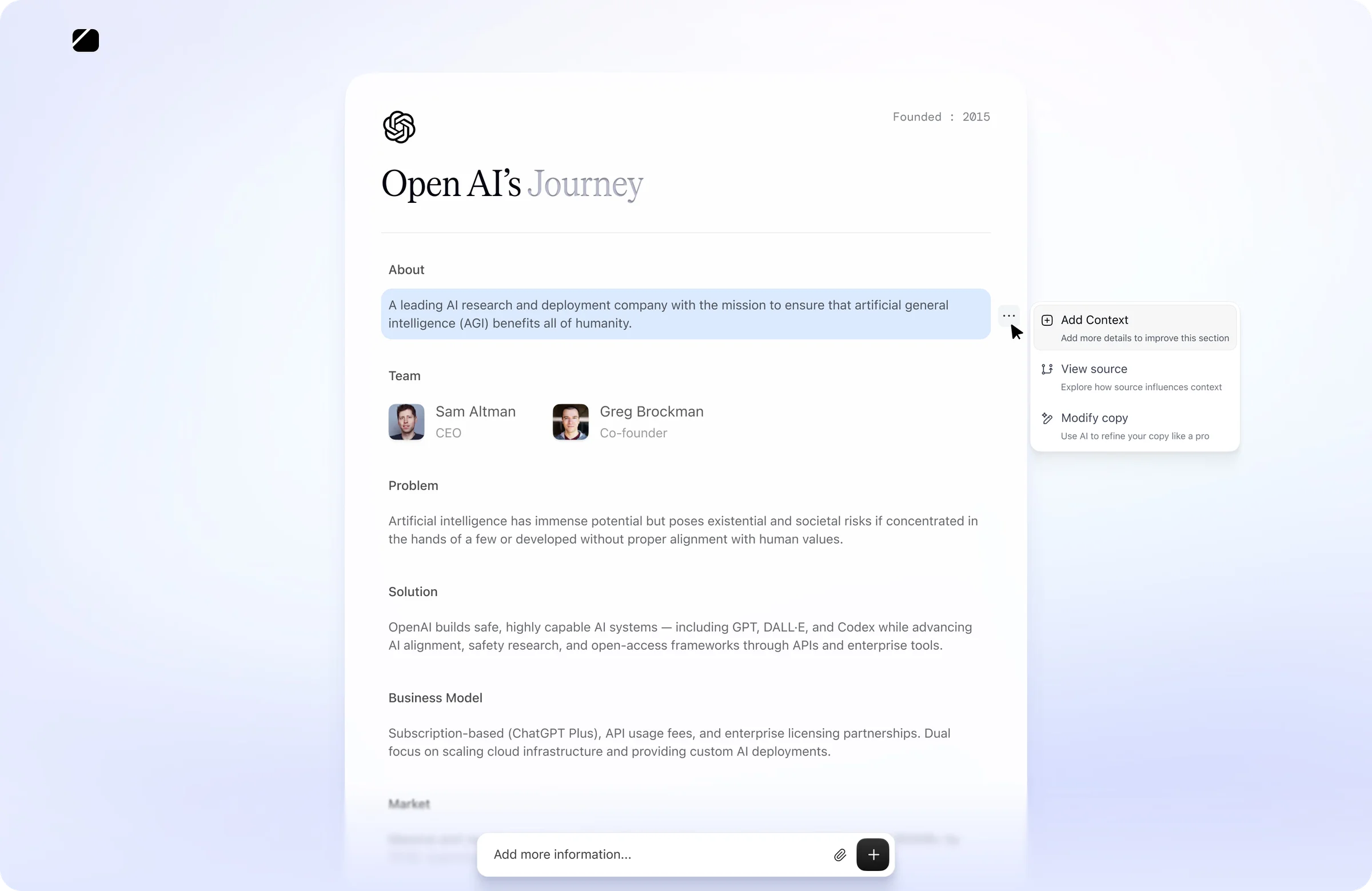
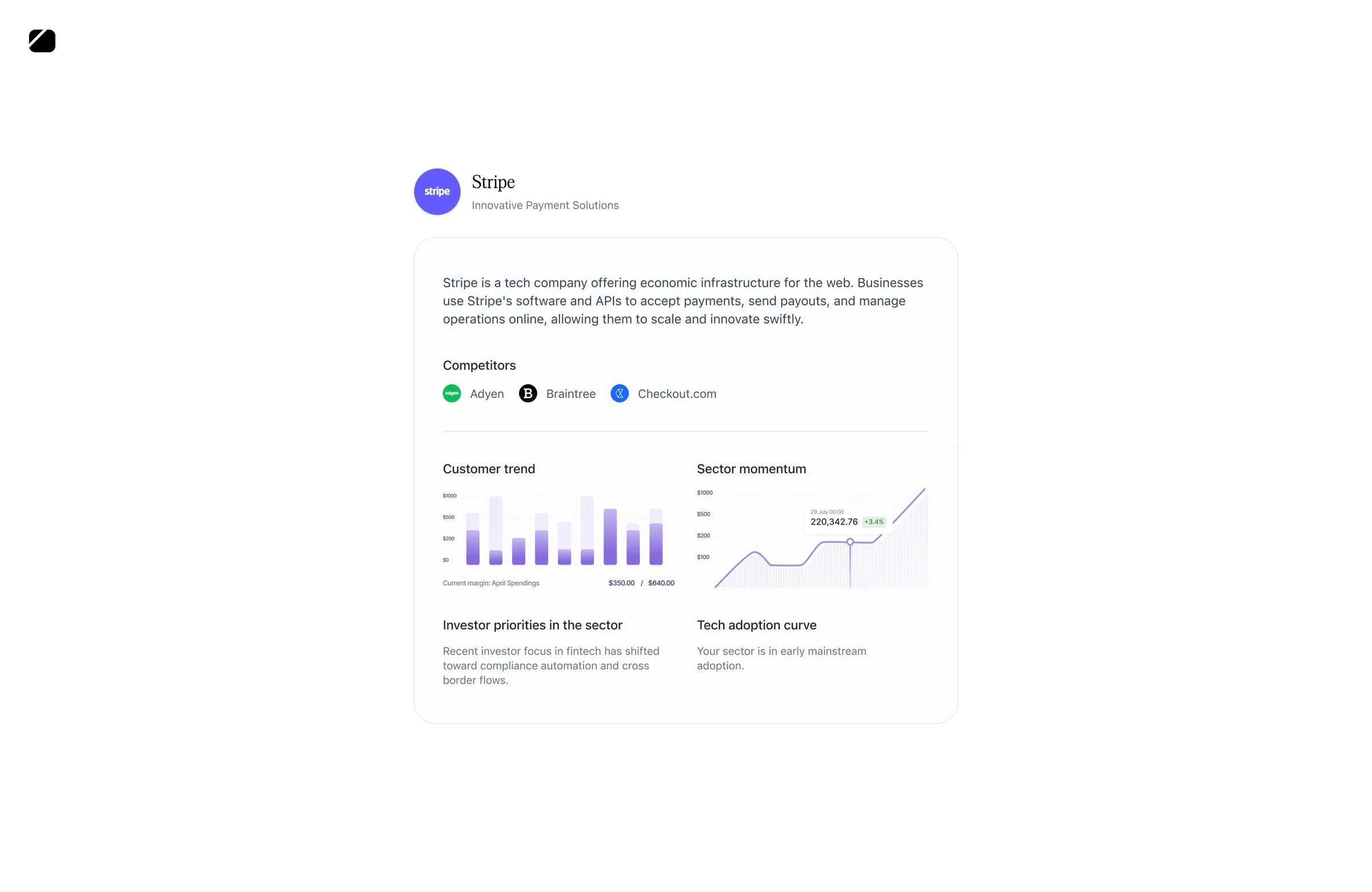
I treated the company snapshot as a reusable output for founders. It brought the research into a summary they could share and update, giving the application value beyond submitting for funding.
Some founders discovered competitors they had not known about, showing that the research could offer useful information even before an investor responded.
Iterations
A summary-editing flow became too limited as the research expanded
One early direction centred on a generated company summary. The founder could edit it until they were happy with how the company was described. It offered a familiar interaction: review a single account of the business and improve it directly.
This worked for the narrower scope we started with. As the product team expanded the AI’s research capabilities and the breadth of information needed for company evaluation, the summary became too limited to carry the experience. Editing a narrative alone could not accommodate the growing body of research and the specific information still needed from the founder.
I dropped summary editing as the main application direction fairly early. The experience needed a structure for following research and answering targeted questions, rather than relying on the founder to keep refining one summary as the requirements grew.
A mindmap showed relationships, but added interpretation work
I also explored a mindmap to show how findings connected. In review, we questioned whether it helped explain an answer or became another puzzle to solve. I raised that direct access to sources could already address the traceability need.
We moved toward clearer research stages and source access. The exploration helped distinguish two jobs: showing that work was happening, and explaining how a finding had been reached. A visually active representation did not automatically serve both.
Delivery
Keep the structure consistent as the content changes
I developed shared styles and components across upload, processing, questions and submission. Consistent typography, controls, surfaces and state treatments gave changing research content a familiar structure.
I treated state correctness as part of the design quality. During testing, I reported removed files still being processed, inconsistent results for the same document and a graph that stayed frozen after answers.
These were consequential interaction issues: a founder could not confidently interpret a progress signal if it disagreed with what they had just done. I worked with engineering to investigate them and kept the intended interface behavior tied to what the system could support.
Outcomes
An application that felt like a conversation
Founders described the experience as smooth, fast and easy to move through. Immediate feedback made the application feel conversational, while thoughtful follow-up questions helped them explain parts of the business their initial materials had not fully covered. The questions felt relevant to how founders wanted their companies to be understood and evaluated.
More than 500 founders submitted through the app. Starting with existing materials gave them a practical way to share their work, then contribute additional context through focused questions. Investor feedback also highlighted the value of gathering those answers before review, saving a round of clarification before the first call.
“Overall, I really enjoyed the experience. The UX is low friction, and the instant feedback makes the application feel conversational instead of tedious.”
Reflection
Reflection
This project made me more deliberate about the relationship between automation and founder participation. Reusing materials addressed repeated work. Showing the research helped explain what the system was doing. Keeping questions beside the analysis made it clearer where the founder could contribute.
The remaining correction gap is equally important to that learning. In a product that represents someone’s company to investors, the design needs to help them understand and influence that representation throughout the journey.